• We have updated the guidelines regarding posting political content: please see the stickied thread on Website Issues.

Fab Functional Form: Engineered Aesthetics

Cochise

Priest of the cult of the Dog with the Broken Paw
Joined
Jun 17, 2011
Messages
8,474
Do we have a thread on the topic of visual 'rightness'? What I mean is, certain engineering things look right and others look wrong - and quite often the latter do turn out to be 'wrong' . An example would be the first Tay Bridge, which looks like it was made up as it went along (as largely it was). At the time there was nothing equivalent to compare it to, but even so contemporary commentators - perhaps with no particular prescience - commented on how spidery and narrow it was.

The Edsel would be another example, for entirely different reasons.

The Dakota, on the other hand, just looks right. As did the poor old Concorde.

It strikes me as something that would have interested Charles Fort - where does the idea of 'rightness' in such circumstances come from?

To the extent our search engine accommodates me, I can't locate any thread that seems to address this theme.

However ... I'm also uncertain whether I'm fully grasping the theme you propose. I can think of multiple angles or perspectives on issues of visual appearance or ascribed 'rightness' for engineered / designed things. Some relate to the aesthetics of an artifact regardless of its functionality or quality of operation. Others more closely link the ascribed "beauty" to "function" rather than abstract or general aesthetics.

There are beautiful things that aren't worth a damn functionally, and there are quite ugly things that serve a purpose best.

Can you clarify or focus the concept you're alluding to?

In any case, I can spin this sub-discussion off to seed a new thread. If I were confident of the theme I could formulate a title. Or, for that matter, feel free to nominate a title ...
Understood.

I'm really talking about functional things, not jewellery or art. There is (or was) a belief that if a piece of engineering (specifically, but in its broader sense to include cars, motorbikes etc) looks wrong it will also be functionally wrong. My theory would be that it is due to some innate sense of proportion we have.

Example William Dean's 2-2-2 express engines on the GWR. They looked front heavy and they were - after derailments they were rebuilt with an elongated front end as 4-2-2's and not only was their derailment problem fixed, but they were regarded (By the Victorians) as then one of the most handsome locos ever built.

I can't find a 'before' picture on't web which rather spoils my point, but here is an 'after' picture.

https://upload.wikimedia.org/wikipedia/commons/4/4d/GWR_Dean_single_4-2-2_3050_Royal_Sovereign_(Howden,_Boys'_Book_of_Locomotives,_1907).jpg

Not making myself clear am I? Sorry. It's not a big deal, just a theme that occurred to me.
 
Last edited:
I think I know what you're getting at here Cochise.
A good example would be at the cutting edge of vehicle design.

In the pursuit of design excellence in Formula 1 motor racing, there is a commonly held belief that if a car 'looks good' then it usually is, and the opposite is also true - a vehicle that looks either poorly designed, or like it has been somewhat cobbled together from parts bins, is unlikely to win any points.

I give you the McLaren MP4/4 in which Ayrton Senna won 15 of the 16 races during the 1988 season, taking the title.
A classically beautiful looking, clean machine.
1601637259908.png


And then compare that with the Honda RA108 from 2008.
(pass me a bucket)
1601637427190.png

Which retired 4 times each for Button & Barrichello, during the 18 race season, and only achieved a total of 14 points for the team, when the drivers championship was won by Lewis Hamilton claiming 98 points, and the Constructors Championship by Ferrari claiming 172 points.
 
Do we have a thread on the topic of visual 'rightness'? What I mean is, certain engineering things look right and others look wrong - and quite often the latter do turn out to be 'wrong' . An example would be the first Tay Bridge, which looks like it was made up as it went along (as largely it was). At the time there was nothing equivalent to compare it to, but even so contemporary commentators - perhaps with no particular prescience - commented on how spidery and narrow it was.

The Edsel would be another example, for entirely different reasons.

The Dakota, on the other hand, just looks right. As did the poor old Concorde.

It strikes me as something that would have interested Charles Fort - where does the idea of 'rightness' in such circumstances come from?


Ooohh that's a cracker of a thread!

Panther Tank - Just amazing looking, but unreliable intially even though they were getting on top of it and then the war ended.

It's a work of art.

kcF6t.jpg
 
Last edited by a moderator:
Understood.
I'm really talking about functional things, not jewellery or art. There is (or was) a belief that if a piece of engineering (specifically, but in its broader sense to include cars, motorbikes etc) looks wrong it will also be functionally wrong. My theory would be that it is due to some innate sense of proportion we have. ...

Thanks for the additional clues ... It verifies where I thought you were aiming with it ...

I've now set this discussion up as a new thread in Notes & Queries with a working title.
 
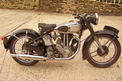
Old British motorcycles often had this. You could choose among many, but I reckon this ES2 makes the point eloquently enough. It must be pretty close to the Platonic ideal, no?

norton-es2.jpg
 
The Formula 1 example illustrates some relevant points.

For things which move at speed there's both a functional requirement and an aesthetic factor that prioritizes being 'clean'. Where aerodynamics are at issue 'clean' describes a form that is maximally streamlined and minimally interrupted or encumbered by protuberances or extensions.

Designs which are aerodynamically clean are relatively integrated so as to appear as wholes. This is the essence of streamlining. From an aesthetic perspective 'clean' implies holism and minimal features that snag the eye into focusing on the particulars rather than the whole.

The Honda race car shown above illustrates the addition of additional spoilers and fins (i.e., add-on gadgetry) to manage aerodynamic issues. Such add-ons may be functionally justified, but beyond a certain point they give the appearance of kludges added to correct for some flaw in the basic form. The end result may be a vehicle that's aerodynamically clean overall, but not 'clean' in the aesthetic sense.

In American motorhead jargon a modification or innovation is called 'clean' if it fits into the form and motif of the vehicle - i.e., if it looks like it's integrated into the whole rather than simply stuck onto the platform.

There's a similar dual characteristic of being 'clean' in marine engineering (boats; submarines).

The functional importance of being 'clean' in reducing environmental resistance is high for moving vehicles, and it lends itself to fostering a sense of being pleasingly 'clean' in terms of aesthetics. This factor (and its attendant aesthetic appeal) isn't necessarily so important or valued for other types of engineered artifacts.
 
Old British motorcycles often had this. You could choose among many, but I reckon this ES2 makes the point eloquently enough. It must be pretty close to the Platonic ideal, no?

View attachment 30280
I had an early Triumph TRW for a while with similar looks - nowhere near so nicely finished though. A previous owner had painted it with something that looked like black tar. It got stolen before I had any chance to do anything about it.
 
Last edited:
Boeing 747 is a very useful plane. It's not particularly pretty though.
 
Boeing 747 is a very useful plane. It's not particularly pretty though.
It is to its pilots - they love the Big Bird. I wouldn't call it pretty, but it still has a certain rightness in proportion which actually is spoiled somewhat in the later ones with the longer hump. Much better looking than the bigger versions of the Airbus, which look bloated.

Opinion, obviously.
 
Yes, they are so ugly they make me cringe.

Everything functional is beautiful. Which means nothing natural or based sensibly on nature is ugly.
 
It's been said that helicopters can't actually fly, they are just so ugly that the Earth repels them.
There are some beautiful helicopters but in particular the early ones are enough to make you barf! And that’s before you ever get in them.
 
It's been said that helicopters can't actually fly, they are just so ugly that the Earth repels them.
I do have a visceral suspicion of helicopters. Tail rotor breaks - you're dead. Autogyos - not so bad, although a work colleague that flew one and had spent a lot of time telling us how safe they were managed to land one upside down - this is not recommended. He recovered fully , fortunately. It was one of the tiny ones like in the James Bond film. I've never actually flown in either.
 
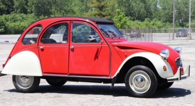
Isn't it primarily in the eye of the beholder though?

To many people, the old 2CV was plug-ugly, but I fell totally in love with its relaxed curves and whole retro vibe:

2cv.JPG

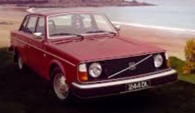
Whereas to me, the ugliest and most unlikeable car I've ever owned was a Volvo 244, which I only bought because a FOAF was offering it very cheap.
Very heavy fuel consumption and utterly charmless.

volvo.JPG
 

I think so.

Despite suspecting that there's much wishful thinking involved in many of the 'natural' examples offered in books and websites on the subject, I don't think there's any doubt that the core of the idea is a sound one.

I use 1.618 an awful lot when I'm making things; not as a hard and fast rule - but if something doesn't look right a quick reference to phi almost always points the way.

I think there may be a thread somewhere.

Edit: Yup - here
 
i am also wondering if it has a bit to do with the flowing curves needed for streamlining? Take sharks, the most efficiently designed creatures I can think of. The Mako, the fastest shark is probably also the most beautiful.

https://th.bing.com/th/id/OIP.aoeG2ZxHDq-Vz0bRAOoMtAHaEK?pid=Api

The ugliest shark I can think of is the Goblin Shark - a slow swimmer.

https://images2.minutemediacdn.com/...alfloss/537321-alamy-j7ye66.jpg?itok=tymeiNcE

In the engineering world, bridges must be streamlined too to cope with wind and water flowing over them. The Boeing 747 is not built for speed. Concord was. The LNER A4 class locomotives are rather more beautiful than Stevensons Rocket (though it does have a certain charm I admit). Or any other train really.

Though it seems like helicopter buck that trend! Apparently the fastest helicopter in the world is not the Chinook or Apache but the Eurocopter!

Scroll to the bottom. Trigger warning - that is one UGLY helicopter.

https://www.wonderslist.com/10-fastest-helicopters-in-the-world/
That is spectacularly ugly.
 
It looks like the designer had a nightmare about gyrocopters.
 
Fender Stratocaster vs Telecaster.
While I know many guitar players who like both I've always felt the Tele looks like an unfinished Strat.
jtIFKyp.jpg


Just need to have it sitting on the back seat of a 68 Mustang :cool:
7xCv7Zv.jpg
 
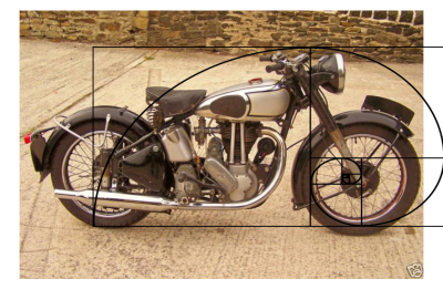
Interesting things certainly emerge, especially around wheel diameter and headstock position, when you superimpose a golden ratio overlay on a picture of a Norton ES2, centring it as best you can on the front and rear wheel spindles (bearing in mind that the bike was not exactly side on in the photo):
norton-es2.png
 
I wonder what Charles Fort would have made of the Hearst Tower?
The original building dates from the 1920s when Fort lived in the area, but then in 2006 the contemporary design of Norman Foster was added.
1601737481719.png

1601737513107.png
 
Back
Top