• We have updated the guidelines regarding posting political content: please see the stickied thread on Website Issues.

Perception, Colour & Language

I don't have time to make a long post but briefly, I think the hard-whorfian idea that we don't distinguish between colours we don't have different words for is nonsense and not supported by the evidence.

However, it does seem to be true that in the need to categorise colours we do end up placing different importances on different colours. For example in Japan, a certain shade of vermilion much used in temples etc has much more recognition and importance then in other cultures.

It is true that in English we think of pink as a separate colour. It seems to me that in Chinese, people think of pink as a clearly separate colour, even though their word for it is 'light red'. In Japanese the word for pink is a relatively recent loanword from English. Before that the closest was a word meaning 'peach coloured' which didn't quite map onto exactly the same concept. Does that mean people couldn't distinguish between red and pink in Japan before its introduction? Obviously not.

The order in which colour words are acquired in different languages may point to the relative perceptual importances of the colours: it's almost always black and white (dark and light), then red, then blue, then all bets are off and we may or may develop a separate label for the concept of 'pink' or not.

The Japanese word for green is also a relatively late addition to the language. Before that, green and blue shared the same word. That's why green traffic lights are called 'blue' in Japanese.

It's also obviously possible to articulate concepts we don't have a specific word for by stringing together other words. I could say 'bright yellowish green', and you'd probably be able to picture what I mean.

In Chinese there are two common words for different greens, which distinction we don't feel the need to make on the word level in English: we qualify if we have to.

Apparently in Russian light blue is a distinct colour from blue. I'd like to hear more about that.

I have noticed that people seem to have slightly different colour boundaries in different cultures. For example, there's a line between what we perceive as red and what we perceive as orange. I've asked various people 'is this red or orange' in ambiguous cases, and they seem to define 'orange' as starting a bit earlier than I do. Same for the line between blue and green.

There's an old meme that the ancient Greeks didn't know the difference between red and blue because homer wrote 'the wine dark sea'. This is (imo) so daft it barely deserves comment. Suffice to say that the concept of 'metaphor' goes way back.

There's another meme that some tribes in Africa can't tell the difference between blue and green because they don't have the words for it. This deserves more attention, but the truth is a bit more complicated. The test actually showed that they found making the distinction a bit more difficult, not impossible (ie they were fractionally slower at sorting colours).

This question also relates to the question of 'can people whose language only contains three number words tell the difference between three chickens and four chickens'?

All this is iirc and subject to be inaccurate, I'll try and dig up my sources later.
 
There's another meme that some tribes in Africa can't tell the difference between blue and green because they don't have the words for it. This deserves more attention, but the truth is a bit more complicated. The test actually showed that they found making the distinction a bit more difficult, not impossible (ie they were fractionally slower at sorting colours).

Well, it seems to be you didn't read one of the links provided. There's some pretty solid looking scientific evidence for the Africa "meme" - and you can check your own ability there as well. To the Himba tribe, there's one square there that sticks out like a sore thumb. To me, not at all. But they have difficulty spotting the (to me) obvious blue square.

https://www.sciencealert.com/humans-didn-t-see-the-colour-blue-until-modern-times-evidence-science
Debatable, see here

http://languagelog.ldc.upenn.edu/nll/?p=17970

the experiment under discussion never actually existed, but was concocted for illustrative purposes by the authors of a BBC documentary: see "Himba color perception", 3/17/2015. And that's why the stimuli don't make seem to correspond to the claims made about them — they're essentially fraudulent
 
Well now... talk about, 'opening a can of worms'...:evil:

Thought this was worth a mention as I was astounded when looking it up via my Granddaughter's apparently simple question!

Fascinating replies - thank y'all so much and please keep then coming.

Meantime, I'll try to explain all of the above to a seven year old...

... or maybe take her down to the playpark instead...:bthumbup:
 
Before I forget...because I must dash....I wonder if pink might be considered to be an "emergent colour"?

What I mean by this (briefly) is that since it can appear as a trace hue, practically-speaking, when white laundry is washed with red; or, occasionally in the sky: does that somehow make pink special? In comparison with tints of blue or red, pink has an unnatural naturalness about it.

The deep pink beloved of little girls (and sometimes adopted by the official canon of gayness) is, to my mind, quite a recent 'colour'. I have no recollection of it existing before the 1980s.

Was 'pink' the same colour as 'fleshtone' (as it were) in the 1970s and 1960s? Were people "in the pink" of good health before pink was a colour? Flower petals will have, somewhere, been pink. But I have a hunch that they won't have been tagged with that colour.

And did pink become a self-standing colour (as opposed to a tint, or a fleshtone) following the advent of colour television, and NOT directly-arising out from the cinema screen?
 
I'm pretty certain "deep" pink existed prior to the 80s, was watching Suspiria only last night, there's some there I think and I'm pretty certain it's there in Victorian if not 1700s paintings/decoration.

Edit - Barbie's from the 50/60s isn't she? I imagine she was marketed/sold with plenty of pink paraphernalia from the beginning.
 
...The deep pink beloved of little girls (and sometimes adopted by the official canon of gayness) is, to my mind, quite a recent 'colour'. I have no recollection of it existing before the 1980s. ...

The English use of 'pink' as a color name goes back at least as far as the late 17th century.

... Flower petals will have, somewhere, been pink. But I have a hunch that they won't have been tagged with that colour.

It's the other way around ... 'Pink' (the English color name) came from 'pink' (a flower).

... Was 'pink' the same colour as 'fleshtone' (as it were) in the 1970s and 1960s?

The earliest English precedent for the color name 'pink' was 'incarnation' ('flesh-color'), which is attested back as far as the 14th century.

The flesh-tone or flesh-color pastels and crayons I've used going back to the 1950's were all shades of pink.

https://www.etymonline.com/word/pink
 
I'm pretty certain "deep" pink existed prior to the 80s, was watching Suspiria only last night, there's some there I think and I'm pretty certain it's there in Victorian if not 1700s paintings/decoration.

Edit - Barbie's from the 50/60s isn't she? I imagine she was marketed/sold with plenty of pink paraphernalia from the beginning.
Not to mention hot pink Cadillacs.

For what it's worth, some of the more garish colours like bright purple became fashionable in the 19th century due to the advent of new coal-based chemical dyes and pigments. Try mixing a nice purple out of blue and red paint: it's not possible.

On a side note, 'purple' as a spectral colour is NOT the same as blue and red mixed together - that's an illusion created by the limitations of our perceptual apparatus. Same goes for the other secondary colours.
 
We know from Giotto that the mediaevals loved pink, even if they didn't have a word for it. In a lot of European languages it's named rose, after the flower. I guess this goes back to Latin.
 
Last edited:
So, only ghost purple is real?
Spectral as in the spectrum on comfortably numb's avatar. If you see orange or purple on a flower or a rainbow it's 'real' as in you're actually seeing light of that wavelength. If you're looking at a computer monitor or something printed using a four colour system, you're not seeing light of that wavelength. It just looks identical because of however the cells in our eyes work - they can't tell the difference. It's a bit like if you could only see in black and white - then all colours would look identically grey.
 
Colour is a label we give to an aspect of our perception of light.

An object does not have an inherent colour. It reflects or absorbs the light that falls onto it. We interpret the reflected light and assign a colour to it according to its wavelength or mixture of wavelengths.

Wavelength is an inherent property of the light that hits our eyes. Colour is secondary phenomenon created by our senses, and also with a cultural influence.

A slightly imperfect analogy about pink:

If we isolate light of a certain wavelength, we will perceive that light as a pure colour from somewhere in the spectrum, e.g. red

If we isolate a sound of a certain wavelength, we will perceive it as a specific musical note, eg middle C.

If we simultaneously play sounds of 3 different, carefully selected, wavelengths, we don't get a note, or even 3 notes, we get a chord. The notes A, C and E played together produce a new thing: the chord A minor.

If we isolate light of 2 or more wavelengths (colours, for short) and shine them into someone's eyes simultaneously, he will not see 1 colour from the spectrum, or 2 colours, but a new colour that is a mixture. It is a sort of "colour chord".

Pink is not a pure colour comprising light of a single wavelength. It is a mixture of wavelengths that, together, we perceive as pink. Brown is another such colour.
 
Color definition is a cultural thing. Behold, for example, mizu.

View attachment 14239

Now to a Westerner, that's a light blue. But to a Japanese person, this isn't blue at all. It is its own color - mizu.

"The existence of these colors doesn't necessarily mean Japanese is more sensitive to color differences overall compared to other languages—it doesn’t have names for some colors we can identify in English, such as magenta or lime. "

I remember being introduced to "mauve" as a kid - it was fashionable in the 70s at some stage. Still looks purple to me, I have no idea how people tell the difference.

http://mentalfloss.com/article/94054/english-doesnt-have-word-color-japanese-does

Mauve is just light purple. The fine distinctions between basically similar colours is surely a function of fashion and marketing. If you have three different tints of nearly white paint on sale you have to have distinctive names for them other than light cream. Magnolia and the like . Ny Mum used to have a predilection for pale yellow ceilings - they were all slightly different - I think I can remember 'jonquil' and 'Jasmine'
 
From the above link:

Pink is not out there, because no color is really "out there." The world is full of electromagnetic radiation, and the only intrinsic properties that this radiation possesses are physical ones such as wavelength and intensity. Color, on the other hand, is all in your head. "Color is not actually a property of light or of objects that reflect light," wrote the biologist Timothy H. Goldsmith in his 2006 Scientific American article What Birds See. "It is a sensation that arises within the brain."

And that really is all you need to know.
 
Fascinating threads merged and bumped.

Please use the SEARCH function before starting new threads on common topics.
 
...Please use the SEARCH function before starting new threads on common topics.
To be fair, I did, it's not always that straightforward and quite evidently not alone in coming up short...!

1547792172683922.jpg
 
Very interesting thread - so the name for the colour pink comes from Pinks (carnations), orange comes from the fruit naranja and Homer's wine-dark sea was blue. Actually the last one resonates with memories of painting in Primary School (early 1960's). I was taught some tosh that all the colours of the spectrum added together makes white - since been told that if Light was white we wouldn't be able to see anything, (there's an assumption that white is the opposite of black ie absence of light). When I mixed all the powder paints available to me in Class I didn't get white, I got bluey brown (the mauve ruined it, mauve always ruins it). But when we washed our brushes out in a jam-jar of water and I took a swig, it tasted of something I later recognised as Beaujolais.
What puzzles me is that Edwin Land invented the first instant colour film for Polaroid after studying JC Maxwell's 3 colour experiments. I don't know how Land came up with his film but it shouldn't be able to capture the lustre of metallic colours such as gold, silver or bronze (the shine varies with the surface angle to the light source). Painters had to add metal to their pigments to achieve a gold effect (ditto car maker) - and yet we see metallic colours in photographs.
 
Painters had to add metal to their pigments to achieve a gold effect (ditto car maker) - and yet we see metallic colours in photographs.

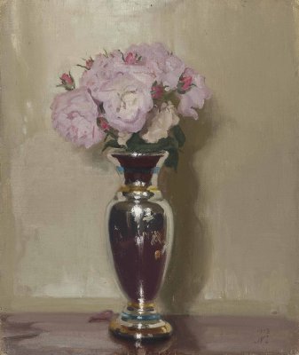
I think Klimt used gold leaf but that was for a more abstract effect, probably inspired by religious icons. It's possible to replicate the lustre and shine of polished metal in oil paints by using different values of grey (for silver) or yellow (for gold). If you look closely at the vase in this painting you can see the different shades of grey cleverly placed, from almost black to white, with no metallic pigments involved.

As to whether or not metallic lustre should show up on early colour photos, what you are perceiving as the 'shine' is still part of the colour spectrum, so I think it's reasonable to expect it to show up on prints.

d5953798a.jpg
 
I was taught some tosh that all the colours of the spectrum added together makes white - since been told that if Light was white we wouldn't be able to see anything, (there's an assumption that white is the opposite of black ie absence of light). When I mixed all the powder paints available to me in Class I didn't get white, I got bluey brown (the mauve ruined it, mauve always ruins it). But when we washed our brushes out in a jam-jar of water and I took a swig, it tasted of something I later recognised as Beaujolais.
The colours of the spectrum added together do make white - repeat the experiment using coloured lights.
Paint and ink don't operate in the same way - they mix subtractively. i.e. they get darker when you mix them.

Something which is untrue and is still taught in schools is that the primary colours of paint are red, yellow, and blue. Magenta and cyan are much better for mixing a full gamut of colours than red and blue. They don't trip off the tongue so easily in kindergarten, though.

EDIT: Side note – there are colours possible on your computer screen that are impossible to print using a regular printer, because the gamuts of RGB and CMYK colourspaces don't match up.
 
Last edited:
Back
Top