• We have updated the guidelines regarding posting political content: please see the stickied thread on Website Issues.

Usborne's 'Unexplained' Series & Other Children's Supernatural Books

The Folklore Podcast covers the Usborne mystery books in general and the republication of 'Ghosts' in particular.

The Fortean Times gets a namecheck.

Episode 61: WORLD OF THE UNKNOWN: GHOSTS.
With guests Anna Howorth and Ashley Thorpe

[Skip to 3:45 for the conversation]

https://thefolklorepodcast.weebly.c...ts-with-guests-anna-howorth-and-ashley-thorpe

Edit: The company rep says that in the UK they printed about 30,000 copies of each of the three titles and they were in print for twenty years.

I doubt that every copy sold, but they are enormous figures, surely?

No wonder every library had one.
 
Was this the book that had the illustration of some guy's nightmare? He'd seen a bloke carrying a coffin. Next morning, sees the same bloke is actually the lift attendant in the hotel he's staying at. He refuses to get into the lift, and it plummets to the doom of all the other occupants. Please tell me yes.
 
Was this the book that had the illustration of some guy's nightmare? He'd seen a bloke carrying a coffin. Next morning, sees the same bloke is actually the lift attendant in the hotel he's staying at. He refuses to get into the lift, and it plummets to the doom of all the other occupants. Please tell me yes.

No, that's from Usborne's Haunted Houses, Ghosts & Spectres. That book also featured in a later combined edition with other paranormal titles that was named: Usborne Guide to the Supernatural World (and had a memorably evil skull on the cover).

lorddufferin.jpg


Edit: individual and combined editions here:

cover_back.jpg
 
No, that's from Usborne's Haunted Houses, Ghosts & Spectres. That book also featured in a later combined edition with other paranormal titles that was titled: Usborne Guide to the Supernatural World (and had a memorably evil skull on the cover).

View attachment 20393

Edit: individual and combined editions here:

View attachment 20394
:bdown: That is incredible. Thank you. Quite the Proustian rush, there. Although I'm surprised I hadn't remembered that your man was quite so resplendently mustachioed.
 
I remembered this from the 1970s...simulacra or "spooky hands"? ;)
 

Attachments

  • usborne.jpg
    usborne.jpg
    804.7 KB · Views: 45
Anna howorth has just said on Twitter that all will be revealed on Hallowe'en...
 
'Ghosts' Back in stock today on Amazon and The Book Depository..just snagged a copy from the latter. Hope they reprint the other 2 in the series, I used to own a Copy of "Monsters" when I was about 7..something about the illustrations in those books mesmerized me back then.
 
'Ghosts' Back in stock today on Amazon and The Book Depository..just snagged a copy from the latter. Hope they reprint the other 2 in the series, I used to own a Copy of "Monsters" when I was about 7..something about the illustrations in those books mesmerized me back then.

It's looking--to me at least--as if they will.

I have to confess, selfishly, that as I already own 'Monsters' and 'UFOs', I'd very much rather they re-publish the three 'Supernatural Guides' (above), which I have not seen since my school days.

That's rather a long shot, I acknowledge.
 
My sister had one of the 'Supernatural Guides' books when I was a kid..think it was the "Mysterious Powers' one. I recall looking at the ad for the omnibus version on the back and wishing I had it..the evil looking fanged skull was neat! I see its going for absurd money on Abe Books these days *sigh*
 
Very generous video preview here.

Full-screen and pause and you can pretty much read it all.

 
No, that's from Usborne's Haunted Houses, Ghosts & Spectres. That book also featured in a later combined edition with other paranormal titles that was named: Usborne Guide to the Supernatural World (and had a memorably evil skull on the cover).

View attachment 20393

Edit: individual and combined editions here:

View attachment 20394

I've caved in and paid too much money for a good quality copy of this for my daughter and me.

I was hesitating (£25 of nostalgia), but the illustration of the 'African elephant spirit' sealed it for me!

usb7.jpg
 
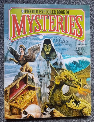
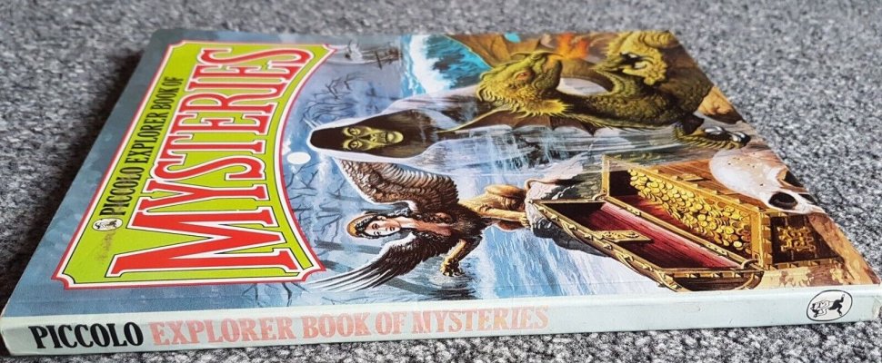
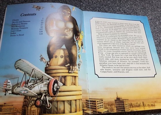
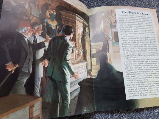
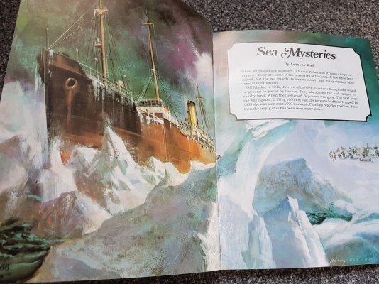
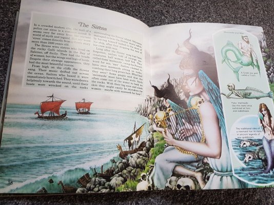
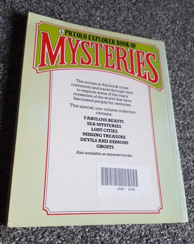
Not Usborne, but I came across a series of preview pictures of this compilation volume of a series previously unknown to me by Piccolo.

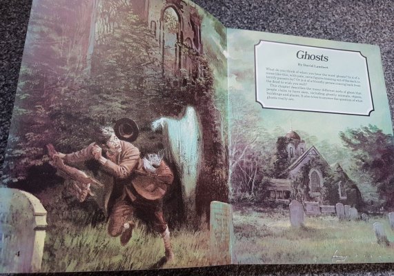
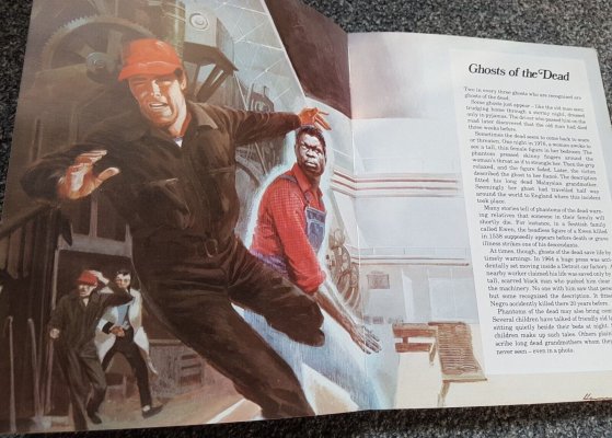
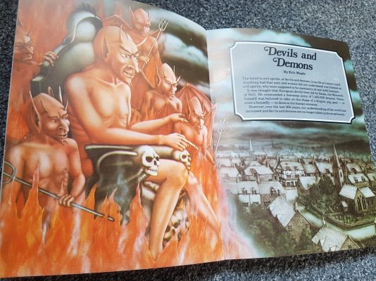
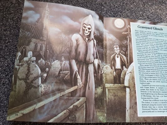
Many of the illustrations, I think you'll agree, are splendid and likely left a deep impression on young readers.

(Click for readable sizes)

s-l1600-89.jpgs-l1600-99.jpgs-l1600-90.jpgs-l1600-91.jpgs-l1600-92.jpgs-l1600-93.jpgs-l1600-94.jpgs-l1600-95.jpgs-l1600-96.jpgs-l1600-97.jpgs-l1600-98.jpg
 
SmartSelect_20230622_122801_Gallery.jpg

The book has survived the perils of the international mail system and is finally in my hands. It's the hardback version ot the first edition and, hence, in much better shape than most examples you see today; the paperback versions have more of a tendency to crack at the spine and come unglued.

I think, when time allows, I shall do a series of page-by-page reflections on the contents that will allow members to 'read along', if they wish.

For now, I shall bask in the dopamine and drift back to the school library in summer!
 
When I think of all the books I collected in my mid to late teens - Harry Price, Hans Holzer, Peter Underwood - and then left at my parents' house for them to dispose of when I moved out...I could weep.
 
I've caved in and paid too much money for a good quality copy of this for my daughter and me.

I was hesitating (£25 of nostalgia), but the illustration of the 'African elephant spirit' sealed it for me!

EXCELLENT parenting that man! :twothumbs:
 
I think, when time allows, I shall do a series of page-by-page reflections on the contents that will allow members to 'read along', if they wish.

Image for reference:

SmartSelect_20230622_122801_Gallery.jpg

There being no time like the present, I give you the first instalment of:

Yith's Painfully Specific Analysis of Usborne's Haunted Houses, Ghosts & Spectres

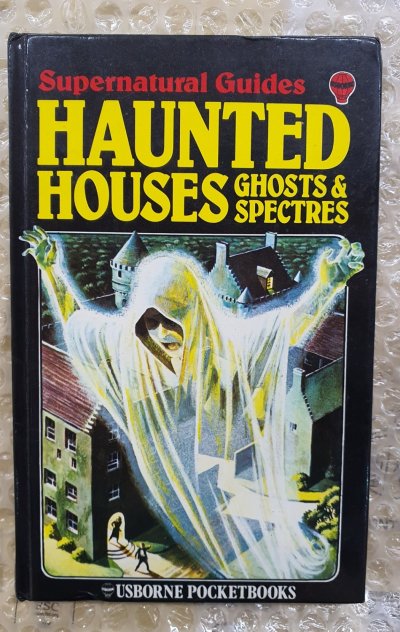
And what better place to start than the title, since it is, on reflection a little odd. The phrase 'Haunted Houses' appears far larger than that of 'Ghosts & Spectres' on the cover, yet despite haunted houses being dutifully granted the opening section, the actual sites of these hauntings quickly take second place to the ghosts themselves. When we consider that the preponderance of cases discussed are of haunted places, objects and people (not houses), would it not have been better to have gone with Hauntings, Ghosts & Spectres or better still Ghosts, Hauntings & Spectres—which is more euphonious?

But even then, what are we to make of 'Ghosts' and 'Spectres' as distinct entities?

Personally, I take the words 'spectre' and 'apparition' as very nearly synonymous: originally 'something seen' and 'something that appears', with a faint suggestion that that which has now become visible may not always have been so. The only point of divergence, it would seem to me, is that 'spectre' acquired a figurative sense back in the eighteenth century to encompass any object of dread that may emerge: starvation, warfare, pestilence etc., where 'apparition' remains pure. Historically speaking, both terms are tied to the concept of 'ghost', 'spectre', I learn, meaning specifically 'a frightening ghost [and] an apparition of the dead as they were in life', and here the mark is firmly struck, for a great number of the cases that feature within these covers focus on fearsome encounters with spirits of the dead who retain an active concern with the world of the living.

So as to title, you take your pick. I might have gone with Ghosts, Hauntings & Apparitions (short, shortish, not at all short).

Moving on, I've discovered something a little odd about the front cover: the hardback edition appears to have been printed slightly differently. The whole design is printed further down than the paperback and is not vertically centred, so there's an incongruously large black strip at the top and very little space at the bottom. This error (?) is not carried over onto the title page or the content page, both of which bear identically formatted (but differently coloured) titles.

Next, the font and colour choices—superb.

Yellow on black looks admirably bold (wasps, radiation, madness!) and the name of the series in a smaller red serves to remind the reader (in a respectfully understated fashion) that there is more on offer should he be so inclined...

If there's one point about which I might quibble, however, it's the presence of the 'USBORNE POCKETBOOKS' label at the bottom:

  • We don't need a fourth colour.
  • The name 'Usborne' features twice on the front cover, once on the spine and (to be pedantic) five times on the rear cover.
  • This is only a 'pocket' book if—as I read elsewhere—one is wearing those freakish dungarees with a pouch that were all the rage when this was published in 1979. And does anybody really care to know the name of the format of the book they are buying?
For my money, this should go along with the misplaced and near illegible Usborne balloon in the top-right corner. As we shall see later, the publisher has managed to cram a huge amount of content inside without the pages ever seeming cluttered—it's masterful composition work—but this ballon seems like a case of filling a gap for the sake of filling a gap—lose it.

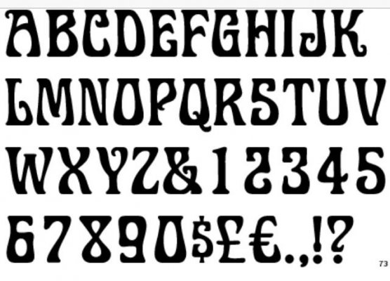
Moving back to the font, I really like this; it covers a lot of bases. The irregularities in the widths and the corrupted symmetry is slightly redolent of those 70s fantasy fonts that took over the world:


ba30b8482ca79fa62a298c85f4c19353.jpg

But only slightly, for at the same time the emphasis on verticality does not permit any descent into hippyish whimsy; this book is to be presented as straight-faced non-fiction without any concession to the sometimes louche vibe of the subject. Last, and perhaps it's my own flight of fantasy, those 'high' serifs on the 'H's, 'A's, 'U's and 'T's seem to mirror the turrets and chimneys of the (manor?) house in the illustration below. If this was deliberate, it was masterful; if not, a happy case of serendipity.

And so to the illustration itself: superlatives fail. What right-thinking child would pass it by without a quick peek inside?

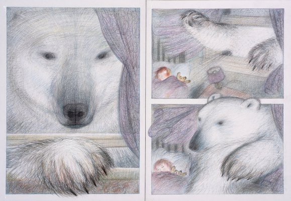
First, an old trick, but an effective one: the over-bounded frame. I think I first became aware of this via Raymond Brigg's The Bear.

Window-page-spread--The-Bear---Raymond-Briggs-1994.jpg

You establish a frame and then have a crucial element 'spill over' the edge of it as if it cannot be contained. The result is an immediate and subliminal connotation of size and power, one that is reinforced in our book by those sweeping lines passing down through the spectre's winding sheet (dynamic movement), not to mention the sickly yellow hue applied to the spirit and the 'electric' blue aura that surrounds it. Even the clutching left hand and (perhaps) involuntarily open mouth seem to suggest a spirit in the grip of power as much as possessing it. And where is this spectre going if he's leaving the frame of the cover? Straight into your bedroom, young reader--potent stuff!

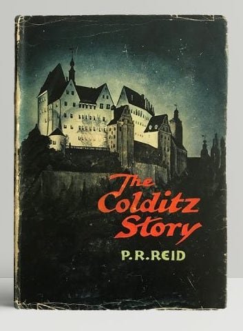
But where is this place? If it's a house, it's certainly a grand one from some sylvan idyll with vague nods to either Scottish or Germanic architecture perhaps; In fact, the first thing I was reminded of on seeing it was this from 1952!

pat_reid_the_colditz_story_first_ed1-600x600.jpg

Eight illustrators are listed for this book, but none is specifically credited with the cover art.

It's immediately clear that there is a
story behind the picture here. The pale blue sheen on the presumably grey walls implies a moonlit night, and you can practically hear the wailing of the ghost has he ascends, appearing to have just swept out of the building with the (new?) owners emerging from the hall in pursuit. At the same time, however, notice that the only other lit room is in the roof of the distant wing on the other side of the property. What, I would suspiciously wonder, is someone up to in there? I can't think of a better way to advertise the nature of the book's mysterious content.

Finally, the spine: solid.

KakaoTalk_Photo_2023-06-23-00-22-44.jpeg

Carries over the formatting and font from the front, but lacking the name of the range in the place that I'd be most expecting to see it. MAPLE & MYRING works well—they sounds like a team—and there's no need for initials or full names (Eric & Lynn).

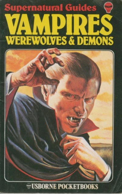
Incidentally, while searching for the publication details of this volume, I discovered earlier that Lynn Myring (now Inglis) later married (and then divorced) Eliot Humberstone, who served as the model for the earlier volume in this series: Vampires, Werewolves & Demons!

Here he is:

usborne-7.jpg

Eric Maple, of course, was a prolific and influential folklorist who worked as a consultant on a number of popular publications towards the end of his career. It's my impression that while much of the writing is not his, he had a significant hand in the selection and the tone of the material used in these books:

https://en.wikipedia.org/wiki/Eric_Maple

Next, if you aren't sick of it already, the Front Free End Paper the Title Page!
 
Cheers Jack, I'd completely forgotten about "The Worlds of the Future" series! I think I had the Robots and Space Travel ones. There was one section in (I think) Space Travel that spooked me back then. It was about a group of tourists in the far flung future who'd teleported to their destination. The creepy thing was the accompanying text, which said something like the tourists weren't "real" people, but replicas created by breaking down the patterns of the originals and beaming it across space. The thought of these replicas enjoying their holiday whilst the the real ones had been destroyed seemed really horrible. I certainly never looked at Star Trek in the same light after reading that!:eek!!!!:
I know I'm replying to a post from 2001, which is a couple of years before I even joined this forum; but I've got a copy of this book, and here's a shot of the page in question. Pretty good for 1979 - someone knew a bit about SF.


I note that the caption doesn't suggest that these people have been 'destroyed', only 'examined', so they are apparently only copies.
page91 - Copy.jpg
 
Last edited:
When I think of all the books I collected in my mid to late teens - Harry Price, Hans Holzer, Peter Underwood - and then left at my parents' house for them to dispose of when I moved out...I could weep.

Me too! Exactly the same.
I can't blame my parents though because it was me that sold them (for much less than they were worth) to a local bookseller. I've been regretting it ever since.
 
Seeing those Usborne book pictures brings back memories, I had some of those books myself and like a lot of people they were my first introduction to the unexplained/paranormal and got me hooked on the subject at an early age.

Like most kids in those days I could take any amount of the kinds of sinister ghost stories and mysteries portrayed in those books, the only thing I every remember slightly freaking me out was a story about someone who woke up feeling like someone was strangling them, which was accompanied by a graphic picture of the alleged event, for some reason that that did give me the creeps for a while. But they were brilliant books.
Ahh happy days!
 
do this thing!!!!!! You should make an audio book
:curt:

Image for reference:

20230629_114449.jpg

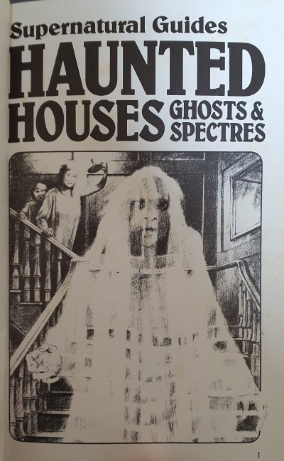
And so we turn to the illustrated title page. I think, technically speaking, a 'frontispiece' must be located on the verso of the first leaf (two-sided page) opposite the recto side of the title page, so this is something else.

First of all, why is this page numbered? I have no idea. The contents page starts at page 4 and so does not include it, and the only words on offer are those of the title that is duplicated exactly from the cover--would anybody ever need to refer to this page by number?

Second, I find it very slightly jarring to see a black and white page like this sandwiched between the boldly contrasting hues of the cover and the full-coloured contents page. It feels, to me at least, a mite misleading, since the majority of the book is printed in full colour and is all the better for it. I think my first reaction on finding the re-emergence of colour on the page that follows would be one of relief.

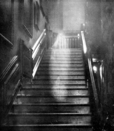
Third, surely this image is inspired or a homage to Captain Hubert C Provand's famous photograph of the Brown Lady of Raynham Hall?

CLI328.country_house_ghosts.6306941-803x920.jpg

Details: https://www.countrylife.co.uk/natur...tographer-captured-an-image-of-a-ghost-234642

Certainly many elements are present: the plausibly eighteenth-century staircase with balusters, the framed mirror or picture frame, the chiaroscuro contrasts, and, of course, the central apparition.

I think the illustrator (again unspecified) has done something rather clever here. Whereas the original photograph fortuitously casts the viewer himself as the sole implied witness (which lends to the lonely atmosphere), he is here joined in the experience by a mother and child (sex unclear) who serve to condition his reaction: the mother bares an anxious expression, but her very presence and her raising of the candlestick suggests curiosity; her child cowers behind her but is also too curious not to peek. This is a feeling--the suspension betwixt fear and curiosity--that I recall very strongly from my own childhood. To limit myself only to the printed page, I had a black-bound red-lettered hardback about the lives of 'Red Indians' (inherited) that portrayed the most bloodthirsty devils alive, and an encyclopaedia of insects whose full-page spreads in 70s gloss both fascinated and horrified me--and yet I looked!

That is the mood here.

And so to the figure. What are we to make of her? Transparent, yes, but not uniformly so. The hands, you will notice, seem somewhat more opaque than her face and torso, buy why? I confess, with the horror aspect in mind, strangulation might be near the top of my speculative list... Or perhaps, to give the illustration some dynamism, we are seeing the apparition in the process of solidification, moving from invisible to visible, transparent to opaque, for reasons and purposes unknown. Once again, as with that lovely cover I discussed last time, there feels as if there is a story behind this picture--something going on--and by turning the page (and buying the book) you yourself will become privy to such tales. Her eyes, for me, are an echo of the poor spectre of the cover: this spirit is animated and driven by some purpose--unwillingly perhaps--and more an ethereal automaton than a being of thought and agency. All this foreshadows the recurring theme of much of the content, which means the picture is doing its job.

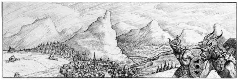
Finally, and again this is very much a personal association, the pencilwork of this picture always reminded me of my much-loved and copiously illustrated copy of Warhammer Fantasy Roleplay (WFRP):

The Old Old World.pngWFRP1_Whitespore.png


Good and Evil.png On the road again.png

The style is slightly vague and sketchy, but each provides enough to suggest both past and future events and imply a wider world beyond the snapshot one is given; for me the Usborne art provides the same.

Please do add any thoughts you might have.

Next time: the Publication/Contents pages.
 
Image for reference:

View attachment 67447

And so we turn to the illustrated title page. I think, technically speaking, a 'frontispiece' must be located on the verso of the first leaf (two-sided page) opposite the recto side of the title page, so this is something else.

First of all, why is this page numbered? I have no idea. The contents page starts at page 4 and so does not include it, and the only words on offer are those of the title that is duplicated exactly from the cover--would anybody ever need to refer to this page by number?

Second, I find it very slightly jarring to see a black and white page like this sandwiched between the boldly contrasting hues of the cover and the full-coloured contents page. It feels, to me at least, a mite misleading, since the majority of the book is printed in full colour and is all the better for it. I think my first reaction on finding the re-emergence of colour on the page that follows would be one of relief.

Third, surely this image is inspired or a homage to Captain Hubert C Provand's famous photograph of the Brown Lady of Raynham Hall?

View attachment 67448

Details: https://www.countrylife.co.uk/natur...tographer-captured-an-image-of-a-ghost-234642

Certainly many elements are present: the plausibly eighteenth-century staircase with balusters, the framed mirror or picture frame, the chiaroscuro contrasts, and, of course, the central apparition.

I think the illustrator (again unspecified) has done something rather clever here. Whereas the original photograph fortuitously casts the viewer himself as the sole implied witness (which lends to the lonely atmosphere), he is here joined in the experience by a mother and child (sex unclear) who serve to condition his reaction: the mother bares an anxious expression, but her very presence and her raising of the candlestick suggests curiosity; her child cowers behind her but is also too curious not to peek. This is a feeling--the suspension betwixt fear and curiosity--that I recall very strongly from my own childhood. To limit myself only to the printed page, I had a black-bound red-lettered hardback about the lives of 'Red Indians' (inherited) that portrayed the most bloodthirsty devils alive, and an encyclopaedia of insects whose full-page spreads in 70s gloss both fascinated and horrified me--and yet I looked!

That is the mood here.

And so to the figure. What are we to make of her? Transparent, yes, but not uniformly so. The hands, you will notice, seem somewhat more opaque than her face and torso, buy why? I confess, with the horror aspect in mind, strangulation might be near the top of my speculative list... Or perhaps, to give the illustration some dynamism, we are seeing the apparition in the process of solidification, moving from invisible to visible, transparent to opaque, for reasons and purposes unknown. Once again, as with that lovely cover I discussed last time, there feels as if there is a story behind this picture--something going on--and by turning the page (and buying the book) you yourself will become privy to such tales. Her eyes, for me, are an echo of the poor spectre of the cover: this spirit is animated and driven by some purpose--unwillingly perhaps--and more an ethereal automaton than a being of thought and agency. All this foreshadows the recurring theme of much of the content, which means the picture is doing its job.

Finally, and again this is very much a personal association, the pencilwork of this picture always reminded me of my much-loved and copiously illustrated copy of Warhammer Fantasy Roleplay (WFRP):

View attachment 67449View attachment 67451


View attachment 67450 View attachment 67452

The style is slightly vague and sketchy, but each provides enough to suggest both past and future events and imply a wider world beyond the snapshot one is given; for me the Usborne art provides the same.

Please do add any thoughts you might have.

Next time: the Publication/Contents pages.

The Publisher's & Contents Pages:

20230705_222851.jpg


Back to full colour and another arresting image. I'm not an expert, but I suggest that this skeleton has a male pelvis and appears to possess the correct number of ribs and vertebrae, which is a good start! The colouration is also, I think, correct for non-living bones. My only slight criticism is the pose. As a child I would likely not have pondered this, but why is this pliant skeleton presenting the information to us as if he had an audience sipping coffees? Neither hand looks very convincing: the left bizarrely gripping without its thumb, the right looking limp and indecisive. An animated skeleton is a potentially brilliant source of horror and fascination, but not one obediently employed as a sandwich-board man.

And indeed, why a skeleton, I ask myself? Yes, there are vague familial associations of ghosts, death and skeletons, certainly, but this book is not 'general horror', and although skeletons do feature, they are not in any way central to the subject. Did they just have a double-page spread they were itching to use?

The watercolour country manor and moorland (perhaps) works well and is a forerunner of many other illustrations in a similar style that we shall shortly see. The storm seems either about to begin (which would make some sense), or drawing to a close. It can only evoke Bulwer-Lytton's famous setting:

It was a dark and stormy night; the rain fell in torrents—except at occasional intervals, when it was checked by a violent gust of wind which swept up the streets (for it is in London that our scene lies), rattling along the housetops, and fiercely agitating the scanty flame of the lamps that struggled against the darkness.

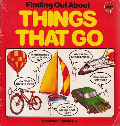
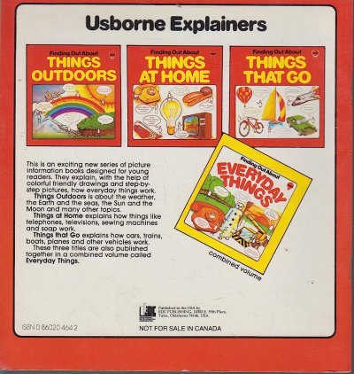
Moving to publication details, we've already met the authors, but our earlier mentioned vampiric-model, it transpires, is also our editor: Eliot Humberstone. I have failed to discover anything of note about him beside the fact that he penned the 'Everyday Things' series for Usborne:

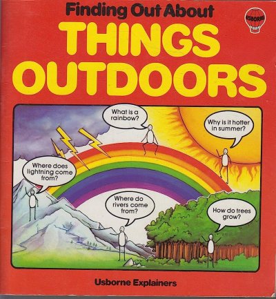
A1DMxWRAX4L._AC_UF1000,1000_QL80_.jpg

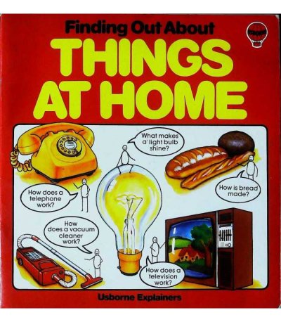
finding-out-about-things-home-eliot-humberstone-9780860205012.jpg

81rTOIICpOL._AC_UF1000,1000_QL80_.jpg
91kC+XUDGBL._AC_UF1000,1000_QL80_.jpg

I do not recall encountering any of these titles as a child, and I have to confess that if I had, I should most probably have thought them awfully dull, but today I find—somehow—that these illustrations possess a slight allure. Perhaps it's fatherhood or perhaps the 'safety' of childhood past, but they seem commendably honest—like Fisher Price, Ladybird or Duplo—devoid of the 'arch and snark' that lurks behind so much children's content today.

It also looks as though Usborne Ltd. has now left Garrick Street (Covent Garden) and relocated to the area about Hatton Garden. I hope they owned that first property in 1979, or buying/renting the second will have been eye-watering.

Going back to Haunted Houses, I note the Folklore Society in the Acknowledgements. This is no surprise given Eric Maple's publications in their journal:

0015587x.1995.9715897.fp.png_v03.png


The Harry Price Collection (now at the University of London Library in Senate House) I am surprised to see cited, only because the brief and general coverage of this book does not seem to demand it, not really even for the references to Harry Price himself. There is a good collection of clippings there, I recall, but any press library could provide access to those. The Metropolitan Special Collection? I don't know what this refers to (anyone?), and one presumes that Wandsworth was the local area for one or both of the authors at the time.

There is some information (not much) on the contributing illustrators here:
https://weirdbones.co.uk/usborne-guide-to-the-supernatural-world/

To get, at last, to the text: About this book.

We first encounter here some of the irregularities that crop up throughout the book, irregularities that are at least partly acknowledged by the publisher's decision to edit them lightly in the reissued versions of the Supernatural World discussed earlier on this thread.
  • Titles, except those containing proper nouns, have only initial capitalisation: 'Like this', 'Not Like This'. This is a stylistic decision against which I do not cavil, but I'd say the most popular choice is to capitalise all important words in the title (i.e. not articles, conjunctions and prepositions). Hence, 'The Most Haunted House in the World?' vs 'The most haunted house in the world'.
  • No ampersands (&) despite the presence of one in the actual book title. I'm a fan, personally—and when it comes to concision, they're a space-saver.
  • Use of numerals over written numbers: 70 vs seventy. Again, a personal choice, but it has always jarred with me to find numerals for 'short' numbers in a line of text. I'd use 'one to ninety-nine', and thence numerals for number phrases that require more than two words: two hundred ghosts but 196 spectres (not 'one hundred and ninety-six spectres').
  • Paragraphs: indentation looks bad here because the paragraphs are invariably short, but they're likely trying to save space. That said, in this first case, I'd have dispensed with the paragraph break even with the change of subject (Ghosts > This Book).
  • Commas: this is the main one. In all the Usborne publications I've seen from this era, usage is irregular; here it is also inconsistent. The reasons, I think, are a combination of a desire (and contemporary educational tendency) to 'write as one speaks', with commas for 'breaths', and slightly shoddy editorial work in regularising submissions from multiple authors. It's not that they are often plain wrong (those on this page are wholly defensible), but rather that they simply that do not seem to be following any set of defined rules. The result is not only that the reader is occasionally 'pulled up short' when he expects to proceed without hindrance, but also that he does not always find a pause when he expects one. To be specific, here we have: For hundreds of years (no comma) people have believed that some houses are haunted. Ghostly figures have mysteriously appeared, (comma) and often vanished without a trace. First we go 'punctuation light' and dispense with the comma following an introductory phrase (which is fine) and opt for two full-stopped sentences over a semicolon (to nod at the causal link), but then the author immediately uses a non-essential 'stylistic' comma for a 'dramatic pause'. Again, in the final sentence we have: There are also stories of fake phantoms, (comma) and some ideas for taking your own 'ghost' photographs. The 'punctuation light' option is to omit the comma (cf. There are also raw materials and some tools for repairing bicycles), but the author evidently wants us to feel that 'list-like' breath he has taken while reading in his head. None of this is wrong, but it feels erratic and is far from limited to this page.
Chapter Order:
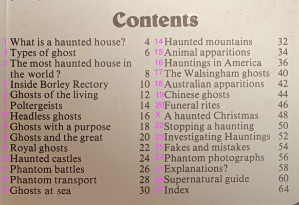
  • I'm not content with this really and append my own suggestions. As discussed earlier, the emphasis of the the title is HAUNTED HOUSES. It would be better if Chapters One to Three were reordered to reflect this before getting into spectral taxonomy.
  • It's clear that the thematic running order was probably intended to be 1) Haunted houses, 2) What are ghosts and what is their function? 3) Historical cases, 4) Haunted places, 5) Investigation & analysis, 6) Conclusions & supplementary matter. The editor got tied up in knots, however, where material in one chapter foreshadowed or incidentally referred to content in another, and he felt that this justified an adjacent placement even when it muddied the overall picture.
  • Controversial perhaps, but the two pages devoted to A Christmas Carol need to go. A nice full-page illustration, yes, but a whole page devoted to a story summary is completely out of place. First, the story is so incredibly famous that most children know it in some form. Second, this is fiction. The whole tone of the book is that this subject, though often reflected in fiction, is real. The big advantage of dumping the chapter would be to free another two pages for a fourth dedicated 'country page' in addition to America, Australia and China. Japan would be an obvious contender, but Ireland or somewhere in Africa, South America or South-East Asia might be even better.
Contents.jpeg

That's about all for now.
 
Back
Top