Except this human . . .Good ol' A.I.
An increase in optical illusions beyond the wit of humans.
 Suddenly discovered that by shrinking the image down, that the hidden message becomes extremely clear! Weird stuff aye!
Except this human . . .Good ol' A.I.
An increase in optical illusions beyond the wit of humans.
Suddenly discovered that by shrinking the image down, that the hidden message becomes extremely clear! Weird stuff aye!Except this human . . .
View attachment 72861
In fairness, there's (I assume) human made chalk drawings on pavements which look like a massive pit or set of stairs, which would only work by the witness looking from a particular vantage point.How do you know that it's human made? It wouldn't work if the lighting was not right.
Ah, I see it now, thanks.")
Clever! I moved back 2m at first, but that's testing my focus (mildly short-sighted), but as I edged back in, it became clear. Now it's hard to unsee it.
(Q #1.) How do you know that it's human made? (Q #2.) It wouldn't work if the lighting was not right.
Sorry, I currently can't use emojis, but I am curious as to (Q #3.) how you found this out, not criticizing your comment.
Suddenly discovered that by shrinking the image down, that the hidden message becomes extremely clear! Weird stuff aye!]I've seen that illusion, but it took all night and sobering up by morning for it to work.The most commonly seen one involves Marilyn Monroe turning into Einstein.
That's really confusing. I think it's got a lot to do with the colours - in the fact that the centre arrows also change there direction and colour which tends to draw the viewers attention to colour influences on each of the coloured wheels (which don't change position in any way, even though they tend to make it appear that they both wobble and move towards, and away from each other.)
I covered the arrows with my thumb nail and it didn't stop any effects.That's really confusing. I think it's got a lot to do with the colours - in the fact that the centre arrows also change there direction and colour which tends to draw the viewers attention to colour influences on each of the coloured wheels (which don't change position in any way, even though they tend to make it appear that they both wobble and move towards, and away from each other.)
Clever stuff! View attachment 73389
Yes, and it doesn't stop. Probably the colours take over to give the same effect (as the lighter colours will grab attention more.) i.e. It must come down to both colours, and arrows being capable of the same deception. (Sneaky!)I covered the arrows with my thumb nail and it didn't stop any effects.
Humans have become the dominant species for a reason.
Enough to drive you dotty, eh!Humans have become the dominant species for a reason.
Is it wise to mess with the way our brain works?
The arrows shape is not what it appears to be - - - "oops!"The pointing arrows illusion:
This one is highly effective. . . I think the suggestive part with the arrows seems to play there part in a suggestive effect in the box's apparent rotation. It appears the 3D aspect of the box and the combination of white, and dark lines make our brain strongly register it's position, but weaker when it's only the black framework, I think that makes us believe that you are 'seeing' the box rotating through the 3D axis' to give the impression (to the brain) that it is turning. "Clever, and hard to try to work out how this one works"I can 'cancel' the urge to see movement here—but it's hard work!
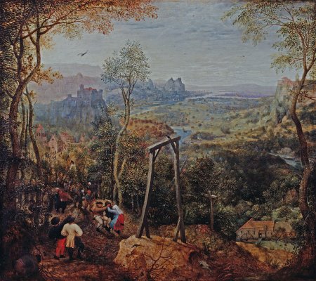
The feet line up in opposition the the crossbeam. It's an impossible object.
Not sure if it's an 'impossible object' - rather more of a big (or a deliberate intention) within the painting, with not giving the right-hand gallows support enough depth of right side leg support, or enough shadow to make the definition of enough distance difference?Pieter Breughel the Elder's 1568 painting The Magpie on the Gallows features an optical illusion in the structure of the scaffold.
The feet line up in opposition the the crossbeam. It's an impossible object.
Rather like the sign I snapped at Hest Bank near Morecambe a few years ago and posted upthread.
#385
Definitely deliberate. It's certainly an impossible object, in the sense that it couldn't possibly exist in three dimensions.It certainly is a very odd and maybe a very purposeful way to depict it like that!
I pondered this as well and came to the same conclusion that it is intentional. I wonder if the artist was interested to see who actually saw his work and enjoyed it.FABULOUS!!!!! I wonder why? Easter egg? Joke? I can't see it as an accident
One for sorrow,
Two for joy,"
How d'you know that then? Plenty of people certainly do stop to enjoy particular works over others. I've seen this during every gallery visit I've made.There are many people who will go to art galleries and talk about the art they see, but fewer who spend time with a work just to experience it and find the joy in one special piece.
We don't know its title for sure. There is no surviving documentation about it.It is called "Magpie on the Gallows"
I just took the name from bottom of the photo posted. I thought that it was the title.How d'you know that then? Plenty of people certainly do stop to enjoy particular works over others. I've seen this during every gallery visit I've made.
We don't know its title for sure. There is no surviving documentation about it.
Some of Breughel's works have a self-evident title, such as 'Flemish Proverbs', although there is no evidence that it was really called that and it is known by other names.
It's certainly a work to study and enjoy.
There is one picture I found online. . . https://upload.wikimedia.org/wikipedia/commons/e/ee/Piero_della_Francesca_-_Nativity_-_WGA17620.jpgI pondered this as well and came to the same conclusion that it is intentional. I wonder if the artist was interested to see who actually saw his work and enjoyed it.
There are many people who will go to art galleries and talk about the art they see, but fewer who spend time with a work just to experience it and find the joy in one special piece.
From @Sid's wiki link:
"There is considerable variation in the lyrics used. A common modern version is:
In this particular piece, I see there is a second magpie (?) at the foot of the odd gallows. I wonder if this is part of the reason for the weird perspective? It is called "Magpie on the Gallows", but is the second magpie also just as important?